
02.03.2018
Workshop: Effektiv visuell kommunizieren
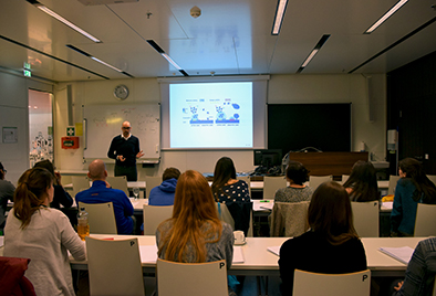
In Zusammenarbeit mit dem österreichweiten Netzwerk für Jungwissenschaftler:innen, ÖGMBT-YLSA (Young Life Scientists Austria), und dem Vizerektorat für Studienangelegenheiten, fand an der Medizin Uni Innsbruck ein Workshop zum Thema „effektive visuelle Kommunikation von Wissenschaft“ statt, bei dem die Teilnehmer:innen lernten, wie die eigene wissenschaftliche Arbeit für ein breites Publikum verständlich und visuell effektiv kommuniziert werden kann.
In dem Workshop mit dem Titel „Effective Visual Communication of Science“, geleitet von Jernej Zupanc, dem Gründer und Direktor von „seyens – help science do science“, ging es vor allem um die Prinzipien der visuellen Kommunikation. Erlernt wurden dabei etwa, wie die eigenen Forschungsideen grafisch zusammengefasst werden können, wobei ein Hauptaugenmerk auf Datenvisualisierung einschließlich der Grundlagen verschiedener Computerprogramme gelegt wurde.
Wie wichtig neue Formen der Wissenschaftskommunikation geworden sind, erklärt Jernej Zupanc im Interview:
Referring to science communication, what has changed in the last years?
The way scientists search and read literature is moving online. Recent surveys show that more than 90 percent of life-scientists use internet search engines for their literature survey. This means that your target audience will most probably first encounter your research publications online. They will skim the paper titles in the search engine results, and then click through a couple of more interesting ones. They won’t read your paper linearly, but might skim it – look at relevant and visually salient parts. They will very likely look at figures and try to see if these can explain the gist of the research. This is all part of the „filtering process“, because the amount of literature being published is overwhelming. Effective figures, including a clear graphical abstract, can attract readers to your publications and help them to decide whether they are relevant, as quickly as possible.
How important is scientific communication on an “easy-understanding level”?
Incredibly important. We have to understand, that peoples‘ attention span is shortening as a consequence of the way we use technology. Although I find this unfortunate, I believe we’ll have to accept it as a fact and learn to live with it. So the way we communicate also has to adapt. As a scientist, you have to communicate very complex ideas and results. It is your responsibility to communicate them so they are easily understood by your audiences. Be it with peer scientists, or with novices, your audience shouldn’t struggle with the way you communicate. Your messages should be understood effortlessly – to the degree that’s possible. In the case of visuals, a well-designed figure is able to hold attention much better than a paragraph of text. It is also possible to develop a message much more clearly through cleverly chosen visuals, connected into an easy to follow eye-flow and grouped through a clear visual hierarchy and color. The last thing you want is your audience to be irritated by having to decipher the non-clear graphics. Researchers used to be supposed to ‘just pick these principles up’ on their own, which was very unfortunate. But this is clearly changing, as the interest for my visual communication workshops is rapidly growing.
Can you describe your workshop?
I’ve prepared the workshop because I would have benefited from such training tremendously during my PhD. It’s comprehensive and easy to follow and helps researchers understand the human visual perception and acquire a toolbox of ready to use approaches for their own science communication. When it comes to journal papers, posters, slide presentations, data visualizations and project proposals, I think two days are enough to get a comprehensive understanding of the visual aspect. On the first day, we learn about human visual perception and essential visual communication principles. This includes lessons on how to use colour and typography, how to visually organize and group visual items and create an intended eye-flow. I’ve distilled these principles from a plethora of fields like graphic design, web page design, journalism, photography, psychology, marketing etc. Moreover, I’ve literally reverse engineered thousands of scientific figures from PLoS and Nature publications, to find out which approaches work and why. We conclude the first day with a hands-on exercise where every participant draws a graphical abstract explaining one of their research messages. In small groups, they get feedback from their peer scientists on how to better present certain parts. This is very important as the participants get to use the language and vocabulary that they acquire during the day. On the second day, we apply the principles to various means of scientific communication and comment on and seek to improve examples from participants‘ materials. Everybody sends me their materials before the workshop, and I prepare their own examples to discuss during the workshop. We discuss conference posters, where we look at the ‚first principles‘ and purpose of scientific conferences and then gradually build up a strategy of how to design the poster to reach a certain goal. We discuss the anatomy of scientific presentations, build a strategy for presenting with slides and look at some common mistakes and how to redesign. We also address data visualization and go over many redesigns of various scientific charts/graphs to see which approaches work best (when & why). We cover digital images in science and when (not) to use which file format. We also touch project proposals and how the evaluation process affects how they should be written. The visual aspect can really influence the perception of the evaluator. I discuss topics that are very rarely talked about. I used to evaluate Horizon 2020 grants (200+ proposals) and have also consulted on several large grant proposals.
After every workshop I ask myself: „What is the topic which I could cover better?“ Then I sit down, dive into the literature and try to improve it. Every time I do a workshop, I try something new. And according to overwhelmingly positive feedback from past participants, I think the approach works.
Ein weiterer Workshop zum Thema wird im Herbst, organisiert vom Service Center Forschung, an der Medizinischen Universität Innsbruck angeboten. Informationen finden Sie hier: https://www.i-med.ac.at/forschung/fortbildung.html
Links:
http://www.seyens.com/
http://www.oegmbt.at/ueber-uns/oegmbt-ylsa
(D. Bullock)